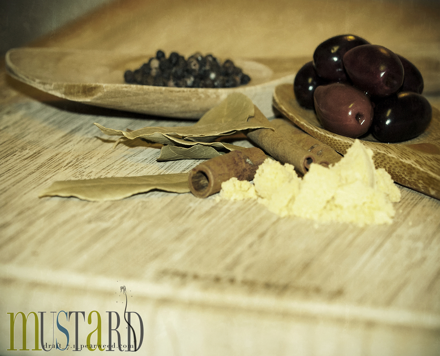
in studying color theory for web design purposes, i’ve found quite a few theories of people who strongly believe each letter of the alphabet should have a specific color assigned to it. i don’t claim to understand their theories, but i do have a favorite theory which assigns each letter to one of three colors; olive, blue or brown.
for as long as I can remember the name of the Crayola crayon “burnt sienna” was my favorite color. it wasn’t the color i liked; it was saying the name. it just seemed to roll off my tongue with such an elegant sound and after discovering it, i always used it in place of brown.
— i said that
Maybe we should develop a Crayola bomb as our next secret weapon. A happiness weapon. A beauty bomb. And every time a crisis developed, we would launch one. It would explode high in the air – explode softly – and send thousands, millions, of little parachutes into the air. Floating down to earth – boxes of Crayolas. And we wouldn’t go cheap either – not little boxes of eight. Boxes of sixty-four with the sharpener built right in. With silver and gold and copper, magenta and peach and lime, amber and umber and all the rest. And people would smile and get a little funny look on their faces and cover the world with imagination.
— Robert Fulghum said that
Exif data:
Aperture Value: 6
Exposure Time: 1/60
Flash: On, return light detected
FNumber: 8
Focal Length: 105
Focal Length In 35mm Film: 157
ISO Speed Ratings: 800
Scene Type: A directly photographed image
Shutter Speed Value: 1/60
User Comment: @pearweed
Lens Model: 105.0 mm f/2.8


Interesting theories that you have shared with us! I was wondering where I knew the color burnt sienna from. A nice composition of mustard made from the tiniest of seeds!
A beautiful image and most interesting narrative.
That is also a color used a lot as a background in painting. There must be a reason for that! A great image!
When I was a wee lad and first heard the name burnt sienna, I became fascinated by the name. I have never forgotten that.
At 16 bits per pixel, a total of 65,536 colors can be defined and displayed. Naming them all should keep the designers at Crayola (or Adobe) busy for a while. Let’s hope they come up with a couple that roll off your tongue.
Those 3 colors fixed perfectly to each other
A beautiful still life composition with an antique feel.
Très attrayant.
You have reminded me of the paintboxes we used to have as kids. Colours like Crimson Lake
Une superbe nature morte ! J’adore 5*
Nice treatment
Beautiful composition and colors . I can understand that for when I make a post-processing ,I make it on my own and…only for the name I try “Peruvian desert” or “Bloody Mary” or “Marco Polo” (in Luminar) …just for the name …!
Bonjour Sherri, quelle belle photo, le rendu est superbe! Bise bonne journée toute douce!
A lovely post, image and narrative both.
COlor runs are sort of a crayola bomb! I like the simple elegance of your photo today.
Beautiful ingredients, display.
A beautiful picture with fine focus and exposure.
Cela fait comme une natrue morte et ces beaux plat superbe
Belle journée
for some reason, your talk of crayons reminded me of tom hanks and meg ryan in ‘you’ve got mail’
he spoke about boquets of sharpened pencils for the month of september
crayons smell good too, don’t you think?
and that picture! you seriously had that on your table? so much beauty.
Those olives, comes the temptation to grasp them
Beautiful Still life.
Robert Fulghum has the best ideas!
I like your story about saying Burnt Sienna. I also happen to really like all those interesting raw ingredients on your table.